
E-commerce is booming. Online ordering was already growing rapidly, and then COVID hit. According to new IBM data, the pandemic has accelerated the shift from brick-and-mortar retail to online ordering by about five years. As things stand, it’s no exaggeration to say that most businesses need some measure of e-commerce to keep customers engaged and sustain revenue — and shopping habits won’t go back to “normal” after the pandemic passes, because consumers and business buyers have found too much to like about online ordering to give it up. 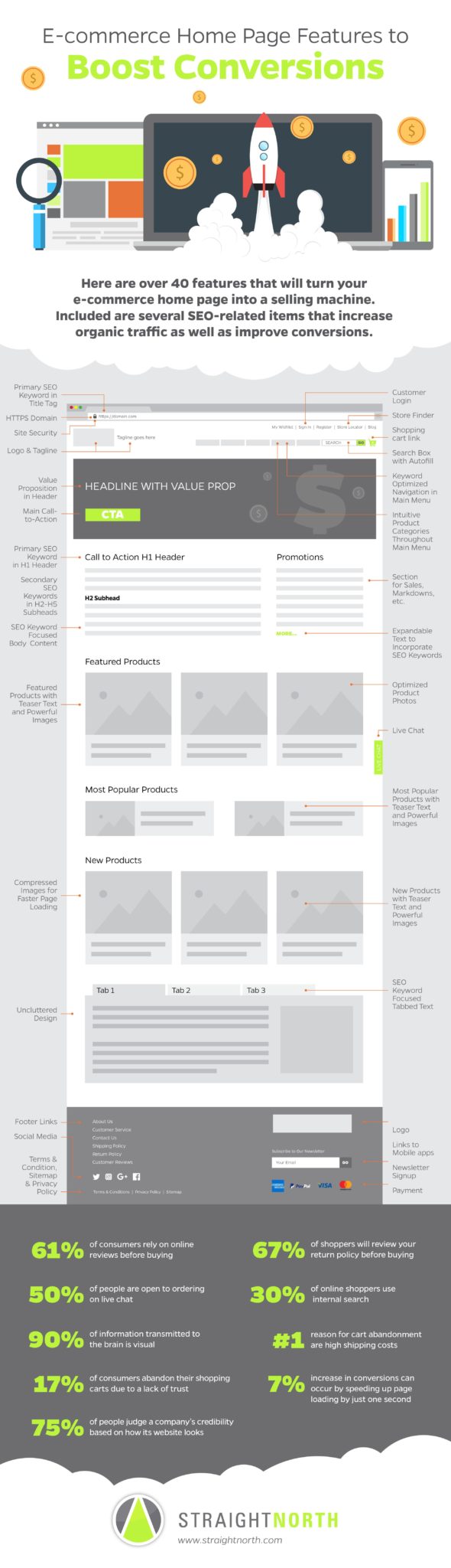
If your business is venturing into e-commerce for the first time, or even if you have a sophisticated online presence already, the infographic below, E-commerce Home Page Features to Boost Conversions, is an extremely valuable resource. First, as the title says, the infographic focuses on just the home page, which is important because best practices for home page design differ from what applies to other parts of an e-commerce site. Second, the infographic includes tips relating not only to content and design, but also SEO. An unoptimized home page means fewer people will find your site when they’re using search engines to buy what you sell, and all of that wonderful content and design work will go unread and unseen.
Perhaps the most important takeaway from the infographic is the need to make the e-commerce home page tell a complicated story in the simplest and most intuitive way possible. This is a real challenge, because there is so much to say, and yet online users prize clean and simple layouts. The layout pictured in the infographic will help you prioritize and organize elements of your story in the most persuasive way possible.
For the most part, home page design is a matter of common sense. Putting your value proposition boldly at the top of the page makes sense because it immediately conveys what your business does and why visitors should care. Once interest is established, it makes sense to flow into blurbs covering your most exciting product/service stories, such as promotions and most popular products. And then, further yet down the page, it makes sense to take a deep dive into specifics about your company and products — visitors who are skeptical or still gathering information will be glad to see it, and visitors who are ready to buy will skip it and move on to interior site pages.
Another element of home page design that can befuddle even the most sophisticated e-commerce minds is main menu navigation. Organizing products or services into intuitive categories without being too detailed or too general is very important: too much detail and the menu options become too difficult to navigate, especially on mobile phones; too little detail frustrates visitors in their efforts to find what they need and makes them to click off. And not only do your navigation elements need the right level of detail, they need to be clearly labeled, optimized for search, and structured for scalability so you can add products and services without overhauling your navigation and web page organization.
Because e-commerce home page design is so complex, an infographic like this, one that provides a simple foundation, is all the more useful. For more details, please continue reading below.
Brad Shorr is Director of Content Strategy for Straight North, a Chicago based Internet marketing company. Brad writes frequently on social media, SEO and copywriting topics.